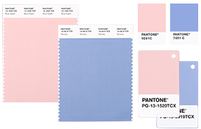
Enter PANTONE's Color of the Year: Rose Quartz and Serenity. The Pantone Color of the Year is selected based on the degree to which the color reflects the current mood and attitude felt in our society. Essentially, it is a symbolic representation of what we are seeing in the world around us.

For the very first time, PANTONE has chosen two shades, Rose Quartz and Serenity, for the PANTONE Color of the Year 2016. Rose Quartz represents a gentle, warm tone reflective of compassion and composure, while Serenity embodies a cooler, relaxed weightlessness and is more consistent with connectivity and wellness. When combined, these shades manifest into a perfect balance of an embracing rose tone with one thats a soothing, tranquil blue, and, together, they symbolize our cultures ability to remain peaceful and kind during turbulent times.
The combination of colors also shed light on our cultures newfound openness to less traditional color associations, indicating an increased willingness to blur gender lines when using color in fashion and design.

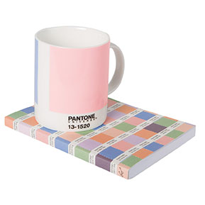
Create a more tranquil space for you and your loved ones by using PANTONE's Color of the Year in any area of your home. Here are a few ways to get started.
Have you incorporated the Pantone Color of the Year in your home? Share it with us on Facebook.